Plan and methods:
°Create an organized composition with no more than 4 objects. Divide your surface into thirds, horizontally and vertically. Choose focal point either in the first third horizontally or vertically. Don’t choose the centre! The area of the focal point should have the greatest contrast.
°Create a coloured ground in a mid-tone colour.
°Prepare Initial sketch using viewfinder or grid;
a. Outline objects
b. Create contrast by adding the darkest and lightest values. Note direction of natural light, and placement of reflective light. Don’t forget that the focal point of your composition should have the highest contrast.
°Color studies
Try various combinations of complementary and secondary colour schemes to see which creates the most harmony and balance.
°Choose medium/s
°Block in darkest, then lightest colours in chosen medium. The Ground colour is already your mid tone.
°Add different values to your shadows
°Put your painting away, safely out of sight until the following day.
°Check your first impression of it with fresh eyes
do any colours stand out more than others? Do you see both warm and cool areas? With squinted eyes do the values seem more or less accurate? Use white and gray to balance tone, and hues or glazes in complementary colours to balance temperatures.
°Refresh your highlights and especially reflective lights.
Format
A3 scale horizontal rectangle
Composition
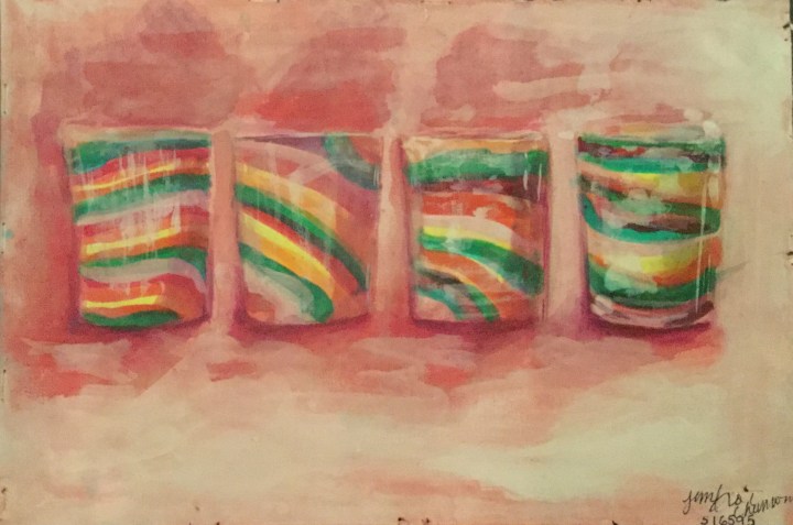
I Chose four blown glass motives which were arranged on a shelf behind a glass door. They were similar in pattern and form, but with slight irregularites. I chose the glass furthest towards the right as my focal point I liked the reflective properties of the objects, the glass door in front of them, and the natural light. In hindsight; It may have been better to choose only three that were totally dissimilar. I chose the glass furthest towards the right as my focal point.
Colour Interest
I aimed to use all pairs of complementary colours; red and green being dominant.
Tonal Contrast
I used a value scale of monochrome reds and an addition of white. Areas with the deepest shadow (core shadow) I painted with the deepest red pigment. As I moved towards the cast shadow, I used more diluted pigment. as I reached the lightest lights, the tone was nearly white with just the slightest tinge of red.
Paint handling
Through my colour studies, I found that the combination of inks and gouache worked best for showing the translucent and reflective properties of glass. With my initial colour studies, I used acrylic and lost the form and luminosity of my composition by the time I had added all the mid tones.
Final Thought
Of the three still life paintings completed so far; I felt the still life in complimentary colours turned out the best. Perhaps because it was the last one I completed, and had gained a bit more practice with the required exercises, research points and my sketchbook.
Regarding assignment one, if I were to repeat it, I would focus more on tonal contrast and create translucent hues in oil glazes. I would also re-evaluate my composition, paying more attention to the environment of the object. I see I have undervalued that in my paintings so far.
Color Studies
Still Life of Blown Glasses


