I’m a Freelance Writer offering creative content in English for the web and in print.
These services include research, blogging, technical, storytelling, editorial, landing pages, press releases, content writing, article writing and essays.
I’ve studied Creative Writing and Visual Arts at UCA, United Kingdom.
I’m American born and hold a Swiss passport.
For examples of previous work and current projects, please contact me directly:
Thank you for your kind consideration,
Jennifer Chamoun, Freelance Writer
Hermosa Beach, California
+1-424-350-8810
jenniferchamoun@ceativewriter.art
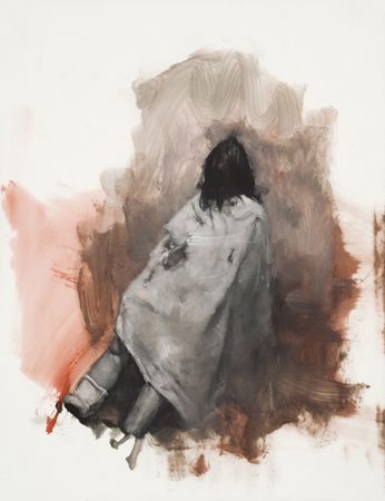
Sophie Jodoin explores themes of violence, highlighting the victims, not the predators. Here she uses minimal interior, that is implied, not seen; a chair propping the victim. Using a limited Palette, she achieves intense contrast between warm and cool, as well as between light and dark tonal values, makes this painting dynamic. Technically, I find it brave painting with oil on both mylar and paper as she does, and wonder how this is safely done. The features of the child are indistinguishable. This symbolizes anonymity to me, as her murderer has effectively dehumanized her. The blanket which covers her in a half-hazard manner serves to absorb blood, not as a gesture of respect. The killer must have been busy. As I can see so little of her body, I’m left to wonder what lies beneath the sheet. In later works by Ms Jodin, she eliminates colour completely, which creates profound shadow and depth.
Homicide 2, oil on mylar Sophie Jodoin
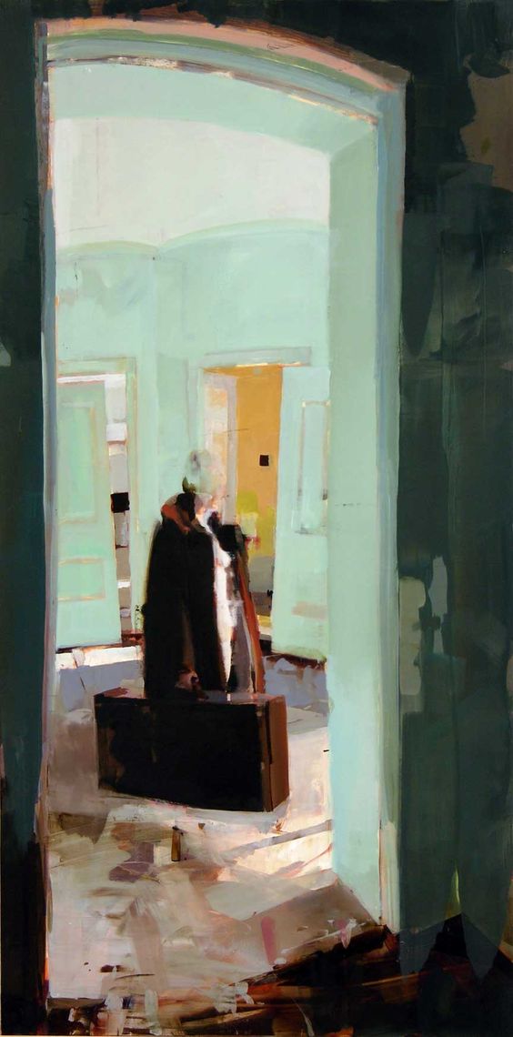
The following two paintings are by Alexander Kanevsky. He uses a technique of painting, rubbing out, and painting over. These multiple oil layers, which blurs the subjects of his paintings, also imply speed of time within stillness. He paints from life and photographs. Before he was solely an artist, he worked as an oncology surgeon. In his work, I see scenes of death and sadness. His paintings are often quite bright and energetic, despite the tale. In the painting below, he imploys rhythms of alternating warm and cool hues. The interiors are often clearly defined with strong lines, while the subjects are not. This solidness symbolizes the constancy of the surroundings, while the subjects are fleeting.
The piece below, I interpret as a story of a woman who is leaving a loved one behind. She is burdened with carrying a large suitcase of their belongings away. The person she lost, must have been in this hospital for quite some time. She’s moving slowly, without certainty. The dark room from which we see withness her, gives us the perspective of the recently departed, as well as the guilt they feel for the old woman’s grief.
Departure Alexander Kanevsky
The second piece (below) captures both speed and motion; the subject is moving faster than in the previous painting and with urgency. The mood is energetic. Mr Kanevsky uses rhythms of long sweeping brush strokes in translucent, light oil paint, alternating with shorter blobs of darker, intense chroma, opaque paint. In this scenario, I feel the emotion of the subject who is being left behind. Perhaps she is a ghost who has not realized her she’s passed on, or someone being confined in a mental institution. Both paintings have a unifying theme; the cleaving of relationships.
Here Marlena Dumas has recorded a moment in time, that would have otherwise been lost. This is not merely a portrait, but a story unfolding. While the mood is sombre, the atmosphere is energetic. The girl depicted is young and fresh. She works with a limited palette of chilled hues in ink washes and/or diluted oils.
Marlene Dumas, The Widow (2013)
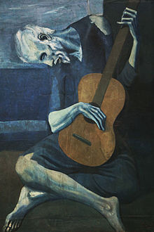
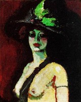
Unlike Marlene Dumas’s above portrait, Picasso’s blue paintingsconvey subjects that are bedraggled, used, or downtrodden. The musician below looks to be already decomposing as if he’d been propped against a wall in a dark corner….no one wanted to fund his burial. The hands which once supported his livelihood are now stiff with rigor -mortis. Picasso has highlighted the bloodless fingers to accentuate the tragedy of this musician. The Guitar itself appears to be warm and alive, making even more of a mockery of the deceased. I’m surprised someone hasn’t stolen it. The subject must be freshly dead. The heavy blues which dominate this period of Picasso, become more monochromatic in other portraits. The paintings symbolize to me a plague of sadness that drained Picasso of his colour.
Pablo Picasso, The Old Guitarist, 1903, Art Institute of Chicago
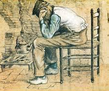
Though the following painting by Vincent Van Gogh is warmer, the mood is sad and hopeless. I know how this story will end, and I am finding myself rather depressed by the scene. It also pangs me with guilt for taking the warmth of my shoe box apartment for granted, when this guy can’t even warm a kettle to boil.
Peasant Sitting by the Fireplace (Worn Out) 2 by Vincent Van Gogh
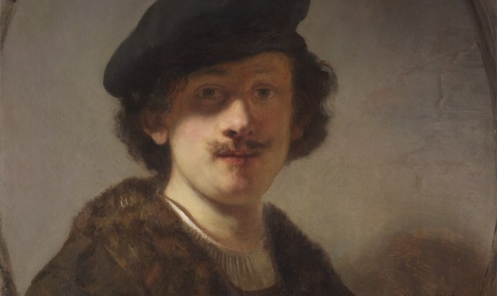
In a self-portrait by Rembrandt, finally, my mood is lifted. With a limited palette, he creates great tonal contrast and a warm overall painting. The expression is kind and trustworthy. I’d let him walk me home at 3:00 am. The lighting is dim, and I presume he was not a man of means, though he appears hopeful and untarnished by all the scenes we know he has witnessed. I feel empathy for him and less intimidated by him, as an old master.
Rembrandt van Rijn, Self-Portrait with Shaded Eyes, RR-110
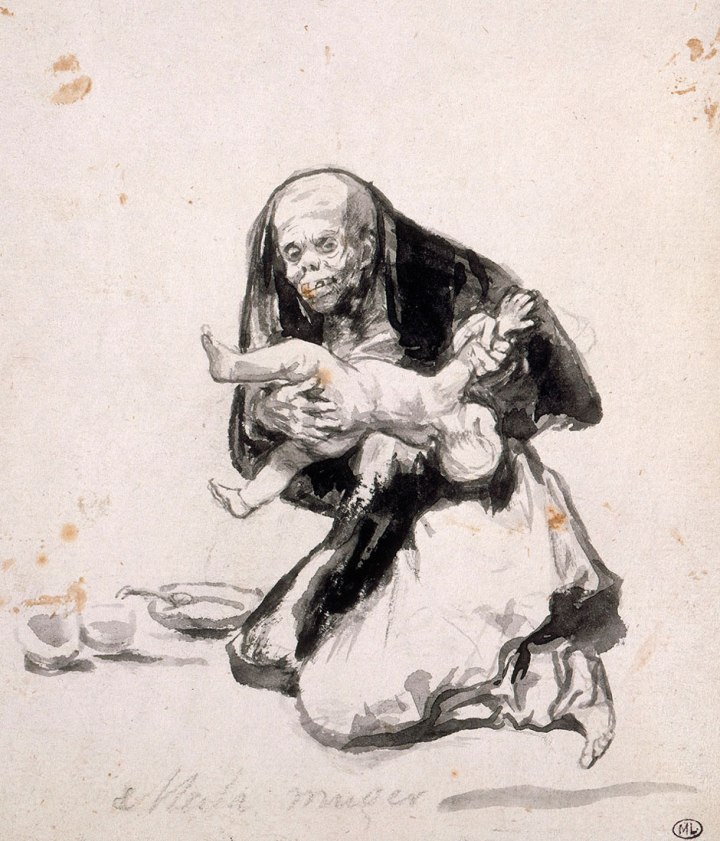
The portrait below was the least disturbing of the most disturbing of Goya’snightmarish pieces. Yet still, I can only glance at it. I am grateful it is a sketch, not enhanced by colour. I do wonder if there is truth in this particular piece or not. It’s clear he is telling horrific tales of suffering during fowl times. So perhaps they are real, and his madness only a reaction to his environment.
Francisco Goya: Wicked Woman, 1819-1823
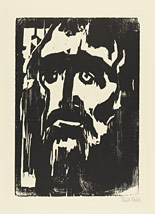
German Expressionist,Emil Nolde, used a Chinese technique here, called woodcut print. I like the bold drooping shapes seen in the portrait below. It appears as though a light source comes from within the subject, which makes him more Jesus like. The face strikes me as disheartened. Perhaps because the artist was formally rejected by the Nazi’s, despite his anti-Semitic sentiment? This leads me to wonder how he rationalized his conflicting beliefs in both Jesus the Jew and fascism.
Emil Nolde Prophet
Alas, with Fauvism, we see more carefree colour. In researching figure paintings from this era, I feel like this was a friendly, happier time. I like how the subjects are often outlined in black and the light dictates changes in colour.
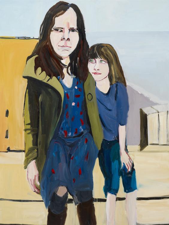
Chantal Joffe’s self-portrait of she and her daughter by the sea appears timid at first glance; but the delicate hues and minimal lines betray the deeper feeling seen upon a second look. The ocean painted in the background (which also appears in other family portraits) is everlasting, while the humans in the foreground exist momentarily. It also conveys deep emotion; hence the cliche’s ‘An ocean of emotion’ or ‘Still waters run deep’. Her motivation for this portrait may have been simply to chronicle family, and she a reluctant subject in the initial photo. She’s painted herself in distorted proportions, while her daughter is portrayed with flattering accuracy. Despite the way she may perceive herself, the little girl adores her mommy all the same. What resonated with me, was the artist’s awareness of life’s frailty and the child’s optimistic oblivion. Perhaps the burden of this knowledge is what gives Ms Joffe melancholy hidden behind a crooked smile.
Self-Portrait with Esme in St Leonards
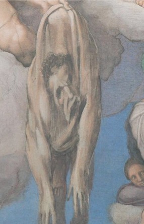
In contrast to Chantal Joffe’s subtlety, Michelangelo’s self-portrait is a blatant statement of emotion. Being a prisoner of Rome, and a slave of the Pope, I can imagine that Michaelangelo was experiencing inconceivable burn-out. In the background we see a cruel, authoritative hand gripping the shell of a human, and dragging it about. I was impressed with the notion that this creature had not only been torn from its core tissues, and soul, but also it’s free will. More proof of disenchanted employment. A smaller female, who is also entrapped (seen more clearly in the full-scale scene of the Sistine Chapel), shares the same curious gaze as Michelangelo, in a direction beyond the painting itself. I am still unsure what they are entertained by in such dire circumstances.
Michelangelo, Detail of St. Bartholomew’s skin in the Last Judgment (1537-1541) Mural. Sistine Chapel, Vatican, Rome
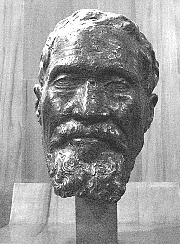
unlike the anguish conveyed in the previous painting, the bronze sculpture below (created from the death mask of Michelangelo by a dear friend), shows a content man finally at peace.
The last impression of the artist Michelangelo’s Death Mask. Giovanni Dall’Orto
Here, David Hockney’s self-portrait demands attention and challenges the viewer. I’m attracted to the rebellious fire-alarm red background, highlighting the blue clarity in his eyes. He knows who he is and understands the world around him. He’s making several defiant statements here: the taboo cigarette hanging from his lips, the fashion faux pas of coupling red with purple, along with his “I don’t give a fuck what you think of me” expression, and even the unconventional medium… as he sketched this simply from his ipad. It’s his confidence in this portrait that I find profound.
Self-portrait, 20 March 2012 (1219), 2012 IPad drawing
In early photos taken in Mr Hockney’s younger years; he appears only mischevious with cautious trepidation. In comparing the former and the latter, I assume that he championed some great battles since then, earning him allowance to contradict everything.
by Lord Snowdon bromide print, 16 April 1963
Elizabeth Peyton’s self-portraits interest me because of the clear lines, fluid mark making and tonal contrasts. She achieves a non-judgemental impression of herself with a limited palette and minimal medium. It inspires me to the same.
Elizabeth Peyton, Ink wash and pencil on paper, 17 x 13 3/4
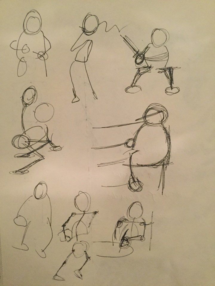
As this is new to me, I realized quickly that I need some guidelines on portions and perspectives in drawings. The only book I found which really suited me, as it included many practical steps to practice was ‘Figure Drawing for All it’s Worth’ by AndrewLoomis. Here he demonstrates how to go from stick drawing in equal proportions in eight sections, drawing the outlines shapes in various perspectives, using spheres and cylinders to give a figure three dimensional form. He also emphasizes which lighting works and which doesn’t, which I found helpful in positioning my sitter or adjusting a lamp. I especially needed this book to understand foreshortening. I could not have drawn full figures without it. What did not work for me, simply because I did not have time for it, was the depth he delves into with musculature attachments. Though still, I find this valuable.
Mark making with pen and ink
I really enjoy fluid mark making, as it is portable and something I can carry supplies with me to exhibitions. I’ve recently purchased some ink brush pens which can be used with other fluid mediums as well. Bob Davies writes a blog entitled ‘Tips for Painting Line & Wash’ on a site I visit frequently called the Art Tutor. Here, he demonstrates pros and cons of different vehicles for mediums, as well as going from lines using a solid pen filling in your sketch with liquid ink (or watercolour). I found this helpful when buying products. I only wish he had posted some short videos of his process.
For additional ideas in mark making, I got tips from Greg Albert’s ‘The Art of Scribbling’. I found this to be a much more carefree style of drawing in which I was able to still achieve a resemblance of likeness to the form I was actually looking at. I liked it because it was much faster than trying to do a proper linear figure sketch; which I still cannot accomplish quickly. The scribbling technique he teaches is also a great way to capture motion. As the illustrator states “Everything has gesture.” Though it is not possible to capture facial features or expressions in small-scale scribbling.
Tonal studies
Because I had no idea what steps to follow when creating a tonal study, and my book collection so for does not cover this, I searched for guidance on the web. Luckily, Will Kemp has a five-part series on creating a black and white portrait from start to finish called ‘How to Paint a Portrait in Oil’. He explains each step and demonstrates his process. He covers everything from the initial drawing to explaining mediums in oil paint, and each pigment he chooses and why. He also gives you alternatives to use if you are missing any of his listed materials. What I didn’t like, as a beginning oil painter was creating a grey scale of 9 values. At the end of my portrait study of my sitter, I really could only discern four values, yet had wasted a lot of time applying them all. Another point is that he painted from a photograph of himself, as I had no photograph, but a real person, it would have been helpful to have seen more instruction from drawing with paint as opposed to sketching from a photograph.
My quest to understand Modern Art
‘This is Modern Art’ by Mathew Collings gave me a timeline of names and pictures to begin to explore the vast expanse of the modern art world. He listed key players from different nations, and what they contributed to the Modern Art movement. What I learned from Mr Collings; was the meaning of the myth of an artist, the various mediums beyond paint which carried the movement (film, print, radio, television, ready-made, minimal shapes, objects, humans sculptures), the value of ‘shock’. Because of Mr Collins, I re-discovered Jackson Pollock and Goya. I also learned that while Salvador Dali considered himself a modern artist, the ‘true’ modern artists did not. They found him too flamboyant and consumed with his own wealth and fame. I was shocked to learn that Picasso, whom I’d believed was the father of the modern art movement, was considered despicable by the others because his paintings were too concerned with beauty. Of course, the previous statements are all based on what Mr Collings has written, and in his writing, he constantly contradicts himself which I find completely annoying. While I do admire this book immensely, I despise the style in which it’s written. Apparently, he wants to make his on modern art statement by confusing the readers. He frequently starts a paragraph with a question, then fails to answer it. He starts on one topic and drifts into another. For all of us who truly are ADHD and trying desperately to assemble our own thoughts in a clear order and stay on only one track at a time, his attempt to pretend like he is also one of us when he clearly is not, is not only confusing but offensive. Perhaps it is meant to prove his point that ‘Nothing matters.’ I think he would understand my appreciation of his book, in a modern art context of course, if I urinated on it and sent it back to him.
One book which was essential in understanding ‘This is Modern Art’, was my ‘Oxford Dictionary of Art & Artists’ By Ian Chilvers. I believe these two books are inseparable. This book helped me answer the unanswered questions of Mr Collings. It provides a concise timeline of art eras and includes the various styles of art created in them. It also gives contextual references to world history, which is important for understanding each movement and why it began. It defines art terms I’d never heard of such as ‘Land’ or ‘Earth Art’. It covers more details than Wikipedia; such as the personal lives of artists (which help define their myths). The only downfall of this book is that it does not contain the elaborate visuals of the later book. It would need to be many volumes larger if it did.
How do I view and understand art?
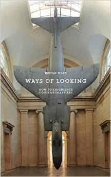
Ossian Ward answers this question most clearly in his book titled ‘Ways of Looking’. I found this was my best read so far, as I could immediately apply what I learned from it in art research and exhibitions. He’s created a simple mnemonic device to help us understand the art which we are looking at Time Association Background Understand Look again Assessment. If you want a detailed explanation of how to apply TABULA, buy the book. He instructs us to go into an exhibition with an open mind, as a clean slate with no preconceived notions. He also emphasizes the importance of knowing the history, time frame, country and circumstances under which each piece is created, and details about the local factors of the artist who created it. Despite being an art critic himself, he advises not to listen to any of them or use their vocabulary in anyway. He also seems to support the smaller art galleries instead of the leaders in the art world. He made me feel unashamed and actually privileged to be starting from scratch. With a fresh point of view. I’m grateful this was on our reading list, and can’t find a thing about it that doesn’t work.
Exhibitions
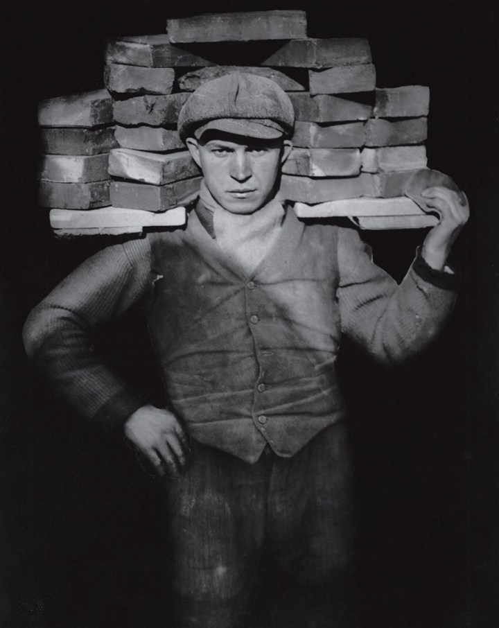
In our neighbourhood, we are lucky enough to have a photography gallery called ‘Photo Bastei’. They hold exhibitions which change every few months and present the yearly Swiss Photo awards competition, which actually hosts work from photographers worldwide. Switzerland is pretty tiny. Since I’ve lived in Zürich they’ve expanded from a three wall garage (I kid you not), to know a three-story space; which even has a cafe, bar, live music and a rentable venue for parties. Most recently I visited the ‘Meister des 20. Jahrhundert. Der Andere Blick ‘ exhibition. It was a compilation of photos of the twentieth century, from another view. I was shocked at the variety of photographers they represented in their collection: most impressively of those was from artist August Sander, a German portrait and documentary photographer:
The Bricklayer by August Sanders
I was researching portraits to better understand composition, lighting and contrast. At first glance, I thought the subject very large and strong to carry all those bricks. Once I looked again, I realized he was actually of much smaller build and has rather small hands. It’s pride and dignity which make him seem grandiose. Though this man’s job was gritty and labour intensive, he is still wearing a button-down vest. It helped to research a bit about his home city of Cologne, and learn that this photo, was taken in 1928, it was taken during a three-year pause from both French and British Occupation until Nazi take over. Later, Cologne became the most heavily bombed city in Europe during WWII. Like other of Mr Sander’s photographs, this one is also taken directly, which gives his subjects a look of power and nobility, making their socio-economic class irrelevant.
The title of the exhibition is quite clever and lives up to its name’…another view’. Because I really needed three times to digest what I was seeing and understand it completely. The arrangements of the photos also debunked myths of the figures being photographed: For example, one wall of photos depicted Che Guevara in a heroic context, but at the end of the row was a photo of Ernest Hemingway and Fidel Castro laughing together, arm over shoulder. At first glance, I felt anger. By the third look, I understood what I was seeing, and in awe of the clever display.
What didn’t work for the exhibition? Well at the entrance there was no-one to greet you. You simply drop 12 CHF in a slotted box and then press the button on the tally counter. I worry that they may get ripped off. I also would have liked a little more explanation of the photos, but since there was no one about, I was happy to research on my own.
‘Taking the Long Way Home’ By Vivian Maier
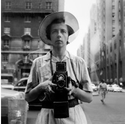
An earlier exhibit of photographs I was privy to, were all taken by Vivian Maier, a New Yorker who collected rolls of film which she left abandoned in a storage unit she could no longer pay for. Sadly Ms Maier found herself homeless the last years of her life. The men who owned the storage unit discovered her enormous collections of film and later developed them. Ms Maier’s work touches me deeply, as she had the ability to catch truly human moments, that others take for granted. I wonder what her days were filled with, and how she must have observed and followed her subjects to catch these eye blinking instances. Below are few I examined:
Self-portrait by Vivian Maier
The subject below has such depth in her eyes. She seems to be lonely, waiting for a phone call.
Vivian Maier
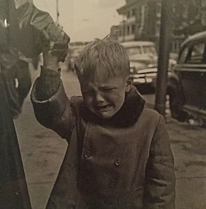
She also captured children in their highest highs and tragic lows.
Vivian Maier
What I feel saddenned by, or what didn’t work for me, is that she was never realized. She seemed one who empathized so strongly with others, and had a truly unbiased lense. Yet no one was there for her, she died alone. You can buy work from this homeless artist who died alone on the streets to fill the pockets of some lucky SOB who probably doesn’t care in the least about her life except for their own financial gain on this website: http://www.vivianmaier.com/gallery/street-1/#slide-50
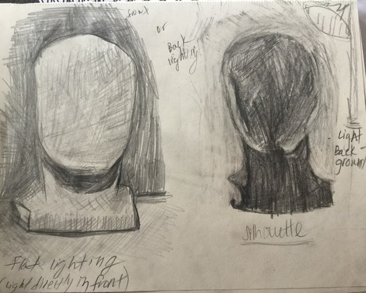
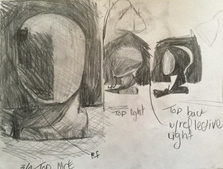
Before beginning this exercise, I studied some different lighting effects, using a single light source.
I had my sitter return to previous position (sketched in the first exercise). I created a small study of washes and outlined his shape in diluted paint.
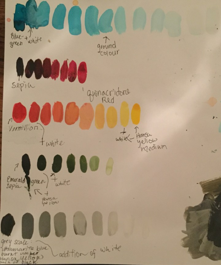
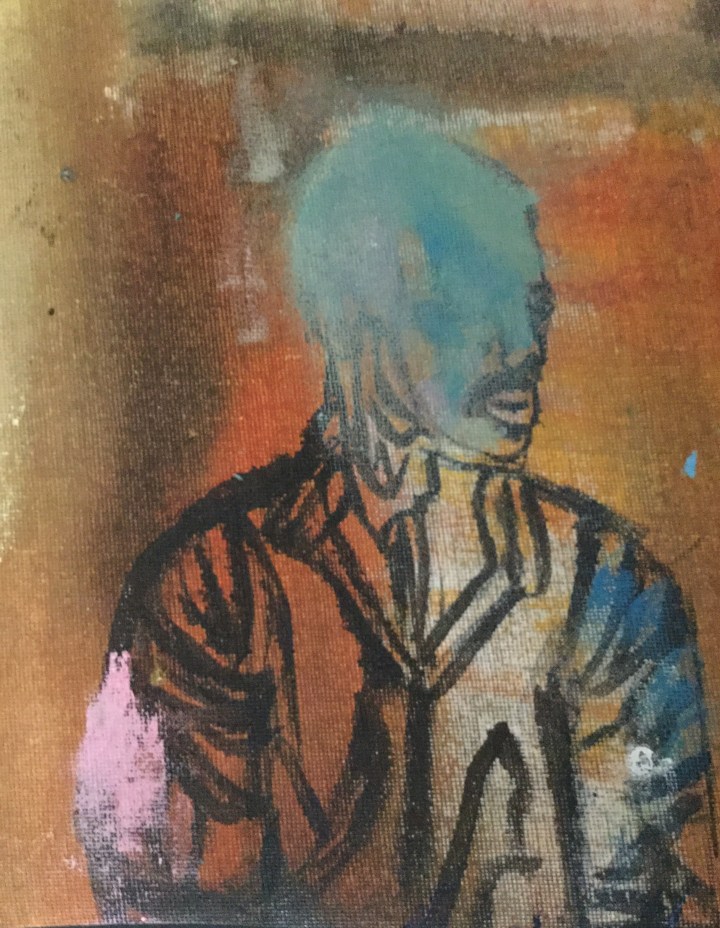
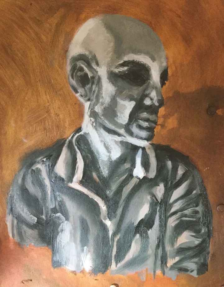
I then began working on larger canvas using a diluted mix of raw umber and OMS. I blocked in the background loosely. I blocked in the darker areas with an even darker raw umber. I dry brushed in the shadow lines. I diluted the umber a bit and filled in the shadows. I used flake white to block in the lightest areas. I marked the position of my sitter and took a break. In the following session, I prepared a greyscale of eight values. I found in the end that it was far too many, and my eyes were strained trying to discern between them. I referenced my previous greyscale done in acrylic, in the first section of our textbook, to create equal values in this oil mixture. This time I added a bit of cadmium red to the blue/ yellow base, to increase the warmth, and created successive values with additions of flake white. I couldn’t achieve enough distinction using flake white, so I switched to titanium white. Four values alone would have been enough. I started with the lightest areas first, then worked my way through the mid-tones to the darkest values. I went back and re-established darkest darks and lightest lights. I then added some gestural marks. During this process, I lost the form and proportions of my work a bit. I also lost my model and to utilize photos to reference shadows and light.
I like the contrast between the warm background and cool subject. Like every painting, it still feels incomplete, but I have to move on to other exercises.
A broad spectrum display from Swiss history From Catholicism, Calvinism, The Reformation, to the poverty before WWII and the boost of the banking industry post-WWII.
Poignant achievements in the largest stained glass collection in history, to Lindt artisan chocolates, The Ski industry, watchmaking, and a couple solid contributors to Modern Art.
Modern religious stained glass
The Steinbock (Capricorn), a symbol of Engadiner pride. An animal which still inhabits the Swiss Alps
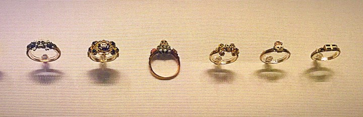
One of many colourful lithography pieces advertising a ski resortAn embarrassing history of child slave labour pre-WWII… Post- WWII: Look! now we have so much gold we can build banks to house all the wealth we’ve stolen.Mourning Jewelry
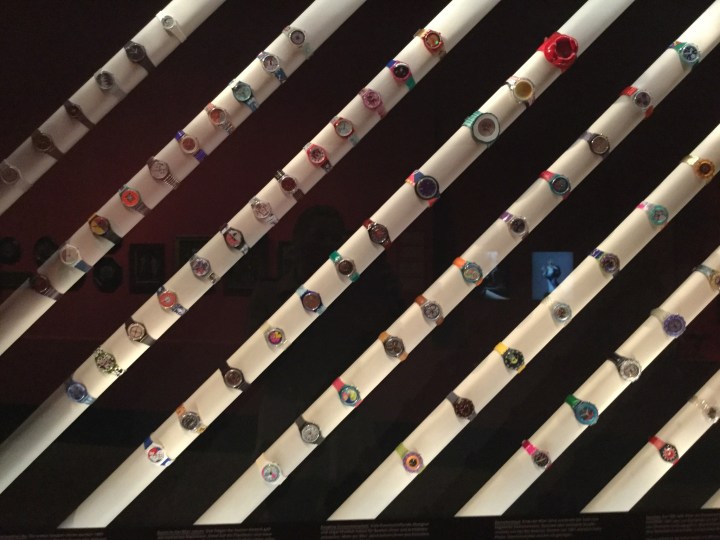
“Swatch” Original Swiss watch…..invented by a Swiss/Lebanese/American Entrepreneur, Nicholas Hayek
Swatch
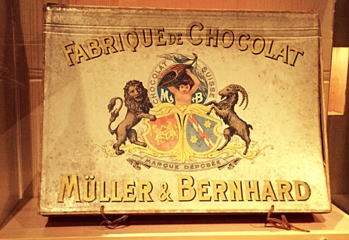
Fabulous Chocolate Factories
One Swiss Modern Artist
that I first learned about at Landes Museum, inspired me to research a bit more, and write about (see the link below):
After learning a bit about Dadaism and surrealism; I was inspired to “Create something shocking” and “Say something new”… Not very easy as everything seems to have been said or done thus far. none the less… Here is my collage
Collage inspired by Modern art’s Meret Oppenheim and Dadaism.
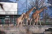
The circus in Zürich
keeps it’s animals in a more comfortable home when they are not performing, during the offseason:
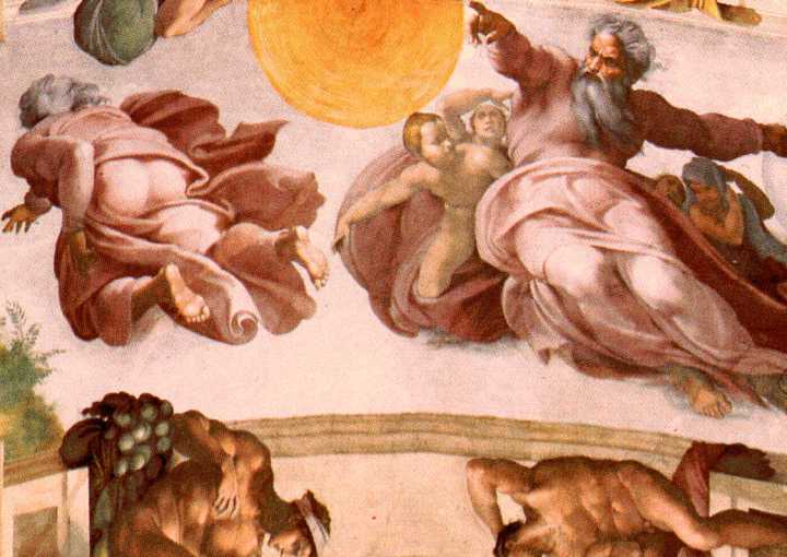
Musei Vaticani, The Sistine Chapel and St. Peter’s Basilica
Here I learned about “Fresco” and “Chiaroscuro”. I saw amazing uses of firelight, candlelight and daylight by Artist Raphael, and saw evidence of sarcasm in paintings by the painter/sculptor Michaelangelo, who may have been more of a hostage, than a guest in Vatican city.
Here I learned about “Fresco” and “Chiaroscuro”. I saw amazing uses of firelight, candlelight and daylight by Artist Raphael, and saw evidence of sarcasm in paintings by the painter/sculptor Michaelangelo, who may have been more of a hostage, than a guest in Vatican city.
Creation of the Sun and Stars, Michaelangelo
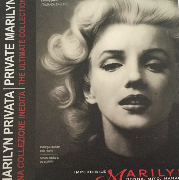
A Catalogue of photographs of Marilyn Monroe
Somehow I found this exhibition very melancholy. A little orphan girl who belonged to no one desperately wanted to be loved by everyone. Though she nearly was, it wasn’t enough to close the aching hole of rejection and loneliness from her infancy, which tainted her relationships, mental health, and perhaps ended her life.
This time around, I had to rethink my composition and increase contrast.
I tried to keep the tones, hues and chroma as close to the truth as my skills would allow me.
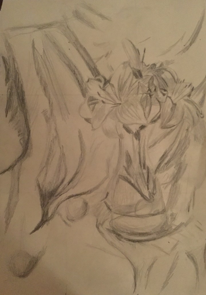
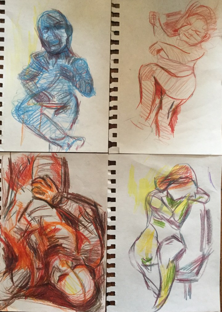
Observational Drawing
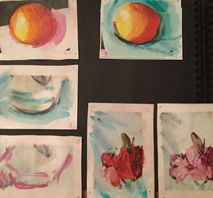
Quick Color Studies
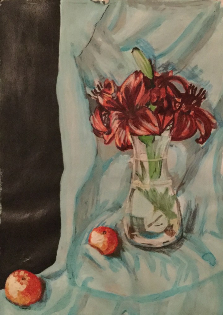
Final Painting
In Conclusion
I found this painting the most challenging, as I expected better results with contrast and fabric folds. I still kept the impressionist styles of broken colour (stippling and dry brush technique), yet I tried to record exactly what I saw, as I saw it.


")
")