Exercise in Colour Accuracy

Floral Still Life, Second Time

This time around, I had to rethink my composition and increase contrast.

I tried to keep the tones, hues and chroma as close to the truth as my skills would allow me.

Observational Drawing

IMG-1534 (2)

Quick Color Studies

IMG-1555

IMG-1554

Final Painting

IMG-1551

In Conclusion

I found this painting the most challenging, as I expected better results with contrast and fabric folds.  I still kept the impressionist styles of broken colour (stippling and dry brush technique), yet I tried to record exactly what I saw, as I saw it.


Exercise Quick Sketches Around the House

One Point Perspective

IMG-1516IMG-1517IMG-1518

Two point perspective drawing in paint

IMG-1562

Conclusion

This was by far the most difficult exercise for me. Simple as it may be for others; I am a total beginner at drawing.  The two-point perspective rough sketch took me a full day.  The drawing in paint took even longer!  The paint handling itself felt a bit clumsy, but luckily gouache is forgiving.

Exercise Still life With Colour Used to Evoke Mood

For this exercise, I used direct painting.

I tried to yield an intimate environment.

IMG_1420

The results were more sinister than I’d hope.  I chose this exercise to improve upon for my “Assignment Two” project.  I started from the beginning, spending time researching how other artist’s had achieved warmth in paintings,  as well as fabric creases and folds.

Assignment 1

Observational Drawing and colour study

IMG_1503

Final Painting using indirect painting

IMG_1508

Notes:

This time I was able to yield a warmer, more intimate result.  I used a fuller range of values and hues of both warm and cool tones, achieving greater tonal contrasts.   I think the painting would have more luminosity had I used oil glazes instead of acrylics.  Achieving fabric folds was the biggest challenge, and I will continue practising techniques by other artists.


Exercise Still Life with Complementary Colours

Observational Drawing

IMG_1499

Color StudyColor study

Painting in Complementary Colors

IMG_1502

Challenges:

The Challenges of this exercise were more in the paint flow of the inks, rather than the colours themselves.  I found I could achieve a huge range of tones, hues and contrast.  I would like to repeat this using opaque colours.


Exercise, Exploring Contrast

Green Squares Surrounded by 6 Colours Within its Spectrum

Center colour seems to diminish the more alike it is to its surrounding colour.

Center colour appears more vibrant the greater the contrast is of its surrounding colour.

exercise I

Two complementary colours mixed, this being the brightest of their scale:

IMG_1492

And its complementary:

IMG_1494

Exploring Contrasts of the complimentary colour pair and neutral colour:

execise II

Because the tonal values of the complementary colours are equal;  I did not see a great difference in contrast when placed near the neutral colour.  I did notice the neutral colour’s hue varies seeming warmer inside the square of reddish complimentary, and cooler inside the square of the greenish complimentary colour.


Exercise, Still Life with Man-made Objects

Plan and methods:

°Create an organized composition with no more than 4 objects. Divide your surface into thirds, horizontally and vertically.  Choose focal point either in the first third horizontally or vertically.  Don’t choose the centre! The area of the focal point should have the greatest contrast.

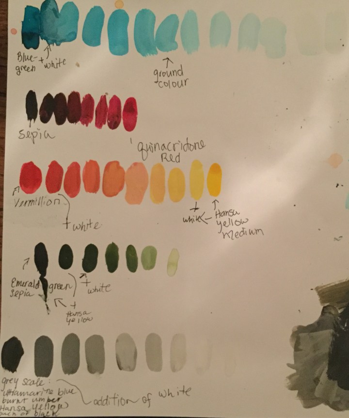
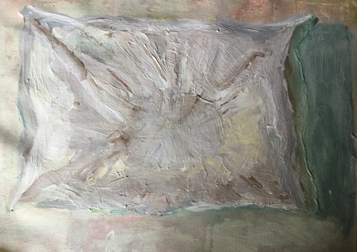
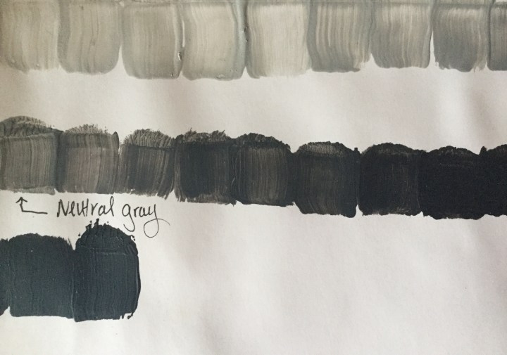
°Create a coloured ground in a mid-tone colour.

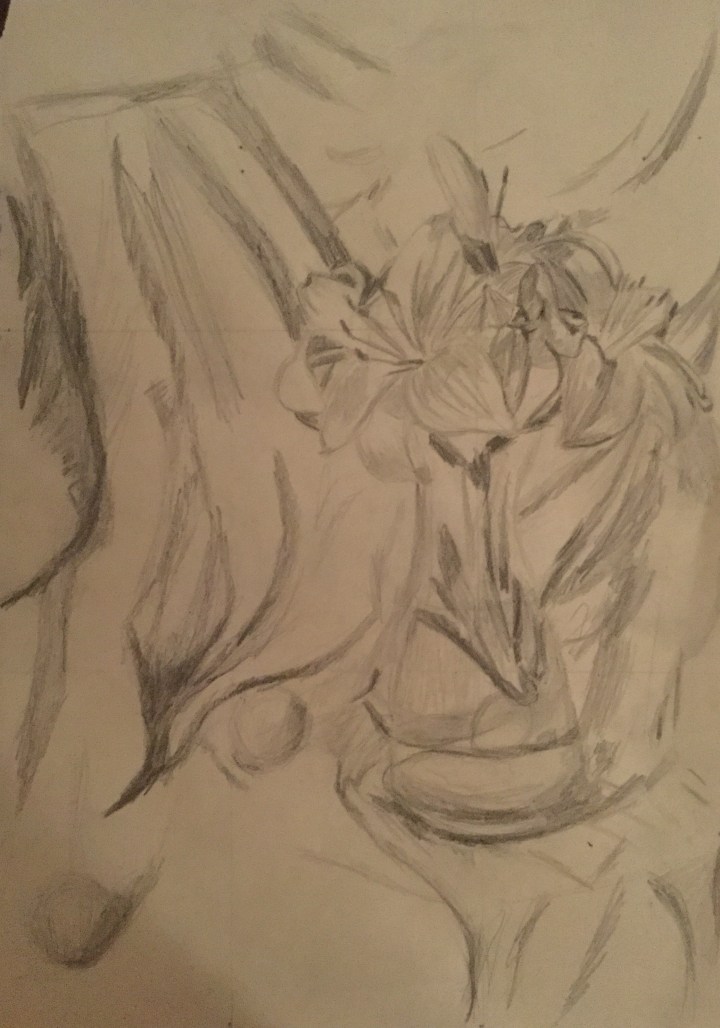
°Prepare Initial sketch using viewfinder or grid;

a. Outline objects

b. Create contrast by adding the darkest and lightest values. Note direction of natural light, and placement of reflective light.  Don’t forget that the focal point of your composition should have the highest contrast.
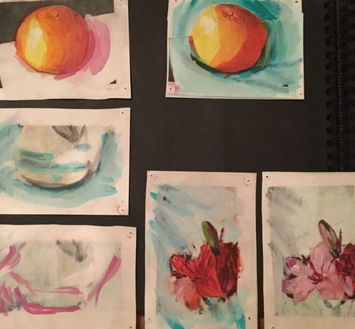
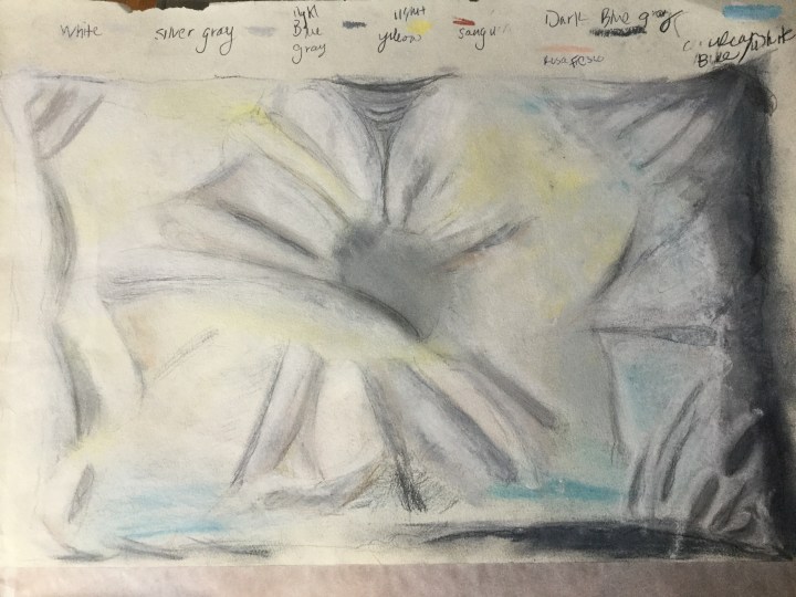
°Color studies

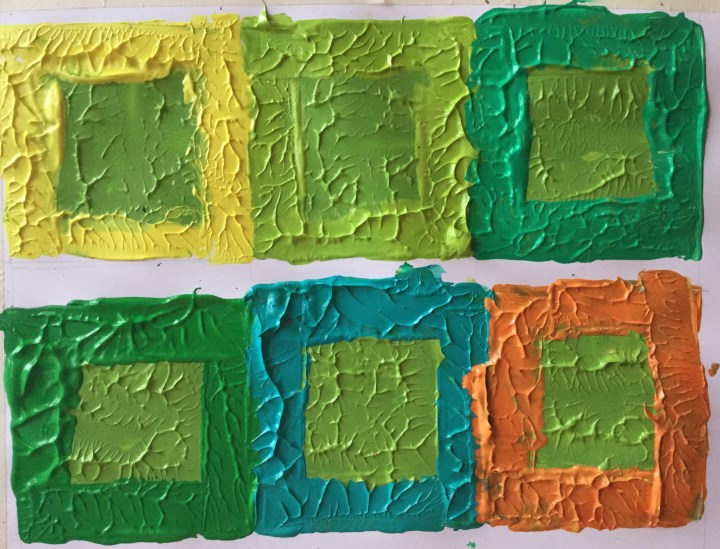
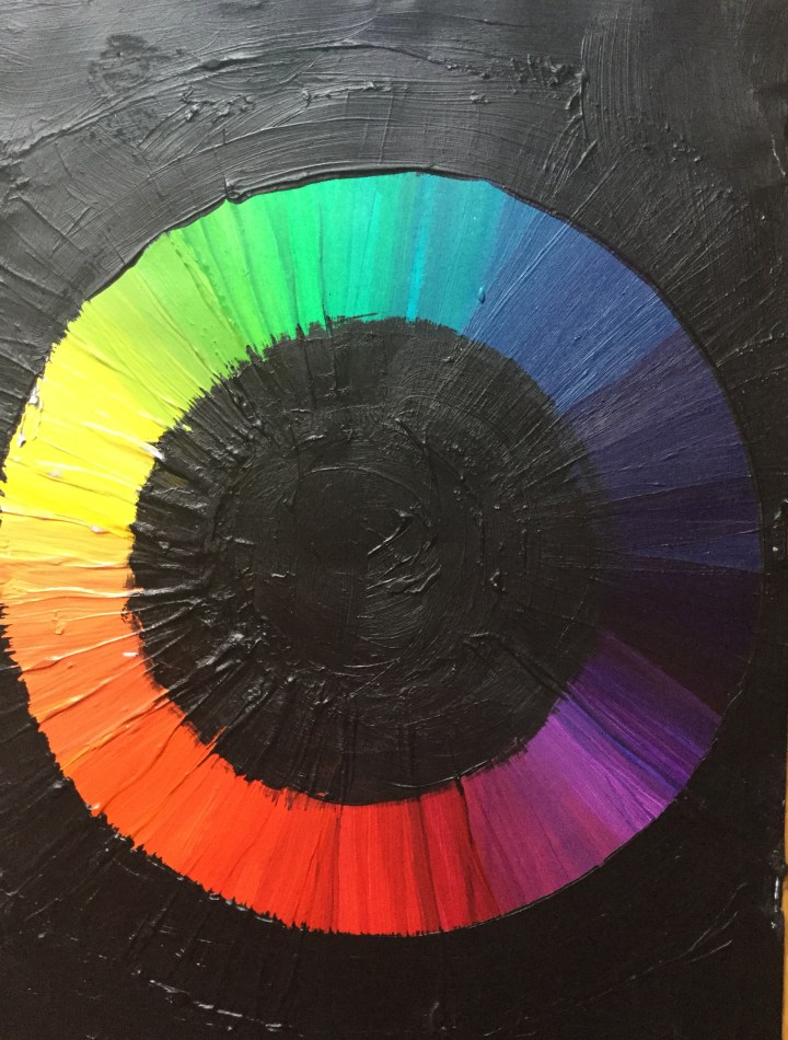
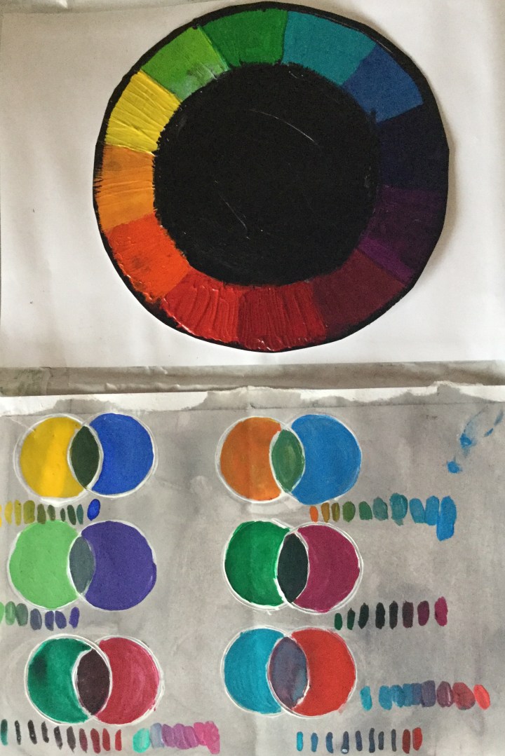
Try various combinations of complementary and secondary colour schemes to see which creates the most harmony and balance.

°Choose medium/s

°Block in darkest, then lightest colours in chosen medium.  The Ground colour is already your mid tone.

°Add different values to your shadows

°Put your painting away, safely out of sight until the following day.

°Check your first impression of it with fresh eyes

do any colours stand out more than others?  Do you see both warm and cool areas? With squinted eyes do the values seem more or less accurate?  Use white and gray to balance tone, and hues or glazes in complementary colours to balance temperatures.

°Refresh your highlights and especially reflective lights.


Format

A3 scale horizontal rectangle

Composition

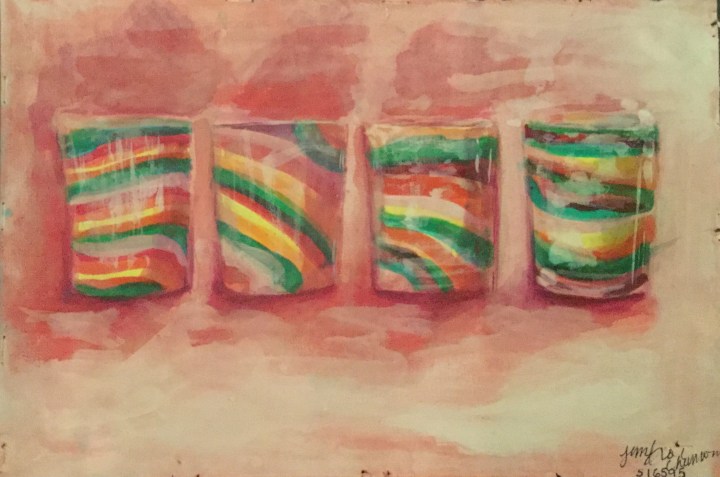
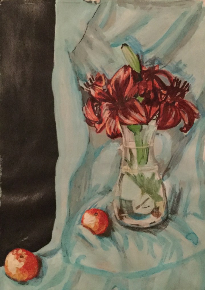
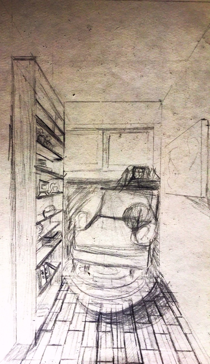
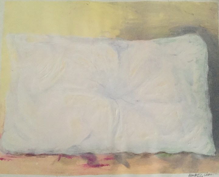
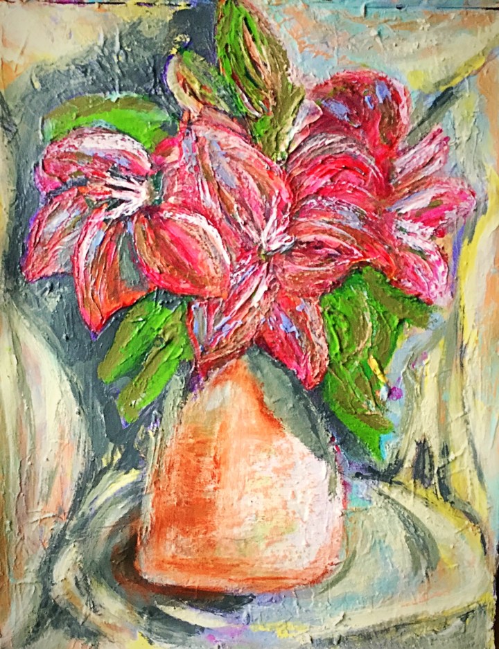
I Chose four blown glass motives which were arranged on a shelf behind a glass door.  They were similar in pattern and form, but with slight irregularites. I chose the glass furthest towards the right as my focal point  I liked the reflective properties of the objects, the glass door in front of them, and the natural light.  In hindsight; It may have been better to choose only three that were totally dissimilar. I chose the glass furthest towards the right as my focal point.

Colour Interest

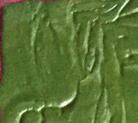
I aimed to use all pairs of complementary colours; red and green being dominant.

Tonal Contrast

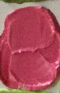
I used a value scale of monochrome reds and an addition of white.  Areas with the deepest shadow (core shadow) I painted with the deepest red pigment.  As I moved towards the cast shadow, I used more diluted pigment. as I reached the lightest lights, the tone was nearly white with just the slightest tinge of red.

Paint handling

Through my colour studies, I found that the combination of inks and gouache worked best for showing the translucent and reflective properties of glass.  With my initial colour studies, I used acrylic and lost the form and luminosity of my composition by the time I had added all the mid tones.

Final Thought

Of the three still life paintings completed so far; I felt the still life in complimentary colours turned out the best.  Perhaps because it was the last one I completed, and had gained a bit more practice with the required exercises, research points and my sketchbook.

Regarding assignment one, if I were to repeat it, I would focus more on tonal contrast and create translucent hues in oil glazes.  I would also re-evaluate my composition, paying more attention to the environment of the object.  I see I have undervalued that in my paintings so far.
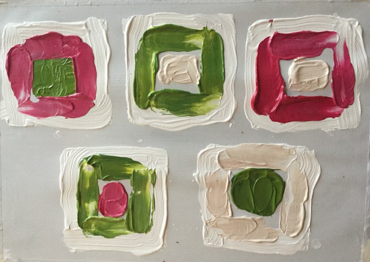
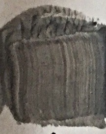
Color Studies

Still Life of Blown Glasses

IMG_1491

Project Still Life With Flowers

Observational Drawings

This exercise I intend to do twice; the first time in an impressionistic style, and the second time in a realist style.  For the realistic style painting (which I have not yet begun), the observational drawing was most important.  For the Impressionistic style painting (which I have completed), capturing accurate detail was not so vital.

Try as I may, I did not succeed in producing lovely fabric folds. Even with the understanding of varying shadows, temperatures, highlights, and reflected light; my sketches resemble broken bones.

Still life with Flowers Painting, Impressionistic Style

Here I used impasto and broken colour in acrylics.  I would prefer oils, but as this was my first try at knife painting; I thought it may be a waste. I appreciated the way form can be achieved without painting actual lines.  

Complementary Colours

helped me achieve colour harmony and a more balanced appearance in my painting:

       °In areas where my flowers seemed too red, I added green to tone them down. 

       °I dry brushed red over the green leaves, as they seemed detached from the rest

         Of the picture.

      °The vase which was initially blue was too cool but warmed

        with the addition of orange.

      °I added yellow to balance the intensity of purple.

      °I used grey and white to make a more tonally graded painting.

     IMG_1412 (1).JPG

Conclusion

This painting was a lot of “firsts” for me; first time regarding complimentary colours, broken colour, and impasto technique.  I am eager to try this in oils, as I really don’t like the flat-plastic results I had here. I’ve seen fabulous examples of portrait paintings where highly pigmented colours were used in a colour block scheme. I’ve also seen acrylics look stunning in abstract art;  it just has not yet happened for me.  

Exercise, Complementary Colours

Color Wheel

IMG_1462

Twelve Colors of Chevreul’s Color Wheel and Circled Pairs of Opposites

IMG_1455

Notes on Complementary colour mixing

Complementary colours placed next to one another seemed to provide the most aesthetically pleasing contrast; with each colour enhancing its opposite. Unfortunately, when complementary colours were combined they yielded ugly greyish results.  Even with the addition of white, I was not able to produce any lovely colours, though it was an improvement.

Exercise, Broken or Tertiary Colours

Tonally Graded Secondary Color Scales

°Orange-red + addition of white, to green blue

This yielded a gorgeous lime green halfway through.

°Green blue + addition of white to orange-red

 resulted in murky grey halfway through.

°Green + addition of white, to orange.

I liked the strong broken colour effect with the second tone, which was the initial addition of orange.


IMG_1459

Exercise Mixing Greys – Anachromatic scale

Tonal Progression

Progressing from white to black, I required an increasingly larger amount of black pigment to achieve the next tone

IMG_1456

Neutral grey

IMG_1474

Neutral grey adjacent white

The grey appears darker next to the white

Neutral grey adjacent black

The grey appears lighter next to the black

In both instances

It seems grey is more than a mixture of black and white but also contains hues of red, yellow in blue, which were less obvious when it was adjacent other grey tones.