Exercise Creating mood and atmosphere, Pg. 90

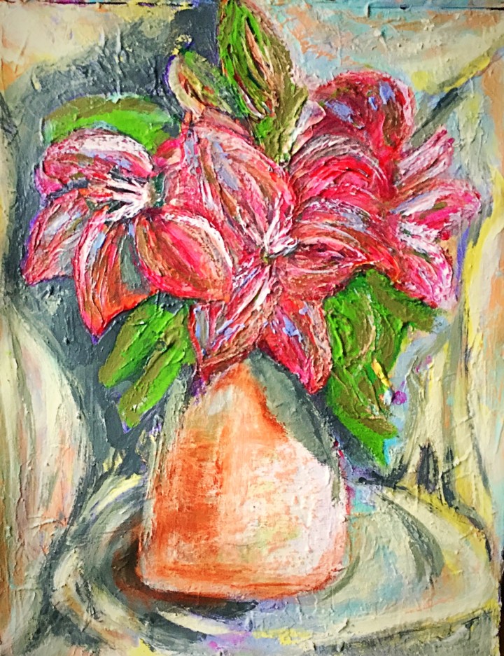
For this study, I set out to achieve an energetic mood, and experiment with colour. I wasn’t attempting unusual likeness. I also wanted to practice more creating background with nondistracting marks and blurred lines.

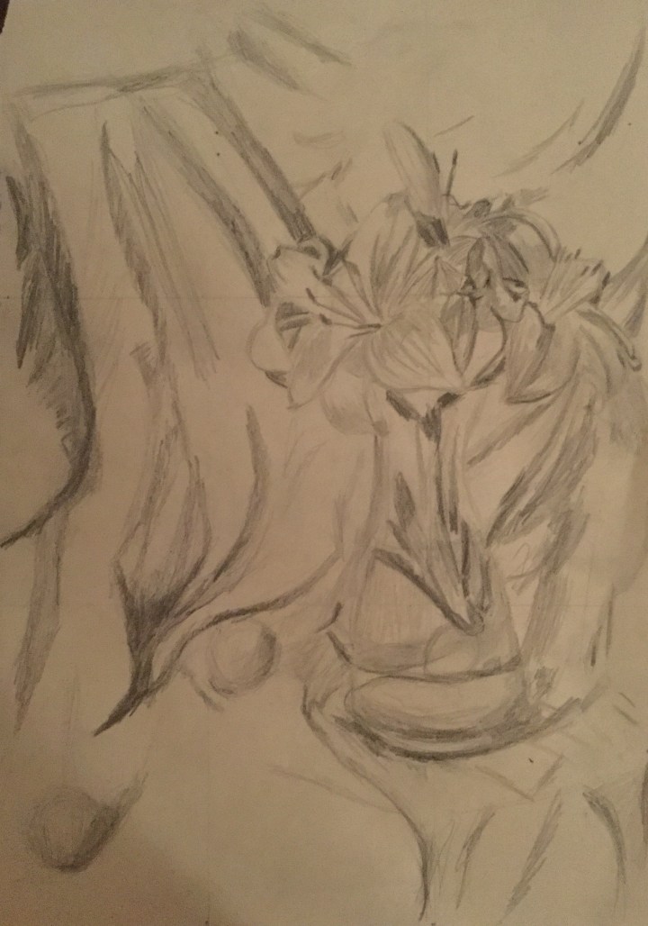
Preliminary sketches using myself as the modelIMG-1925

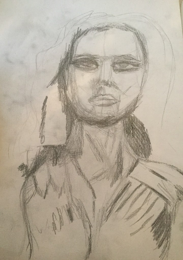
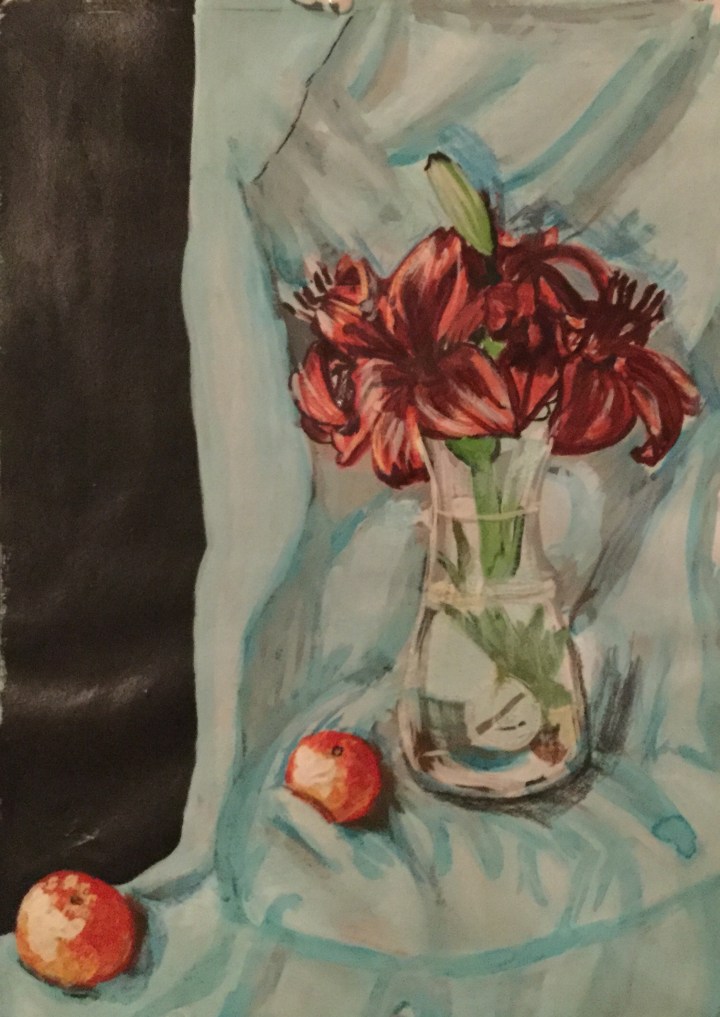
I prefered the second one to the first. I followed the same technique as in my self-portrait; a charcoal sketch with values, fixing, washing in Quinidine red acrylic ink. Unfortunately, I did al of this on the rough side of the canvas which had too much tooth. So I had to add a couple layers of clear gesso and allow drying time. I then rewashed. EF81C569-9D38-423E-A3F1-47E437D53C1B

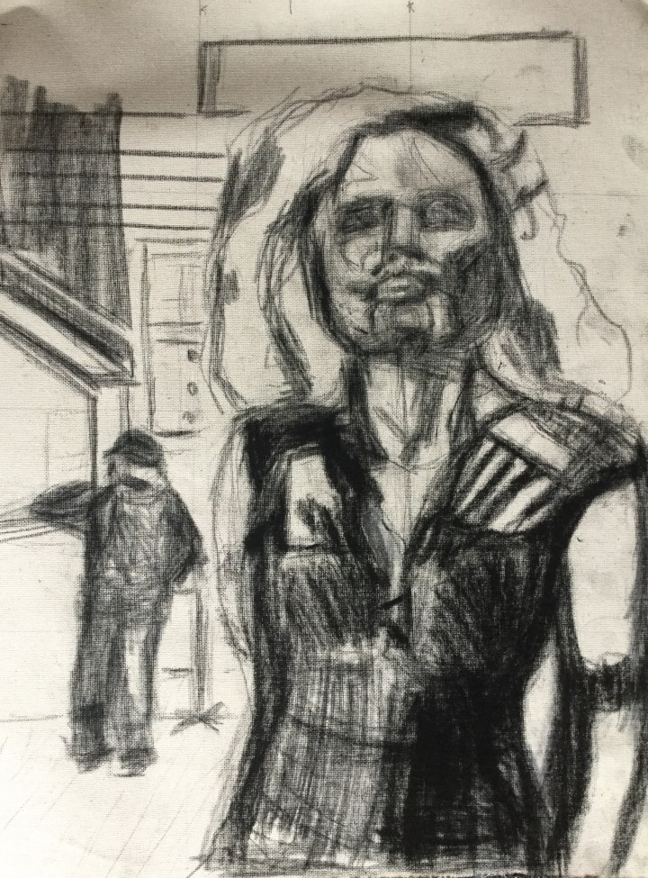
I pinted in the background plus negative shapes first. I outlined the figure in a dark value. Here I made the mistake of not allowing it to dry. I moved onto painting the darkest values and starting to add highlights.  Because my initial lines had become obscured, I lost all the proportions of the figure. I then had to try to re-establish them later, but they were still gross abstractions. Because there was so much medium, the paint was not drying quick enough. I am just learning the handling of oil, now appreciate the “fat over lean” concept. I used an initial colour palette of permanent rose, Ultramarine blue, Pthaleo blue, Pthaleo green, Cadmium yellow, flake white and zink white.10F7D0BD-C360-4E65-BAD1-6EB90793644F

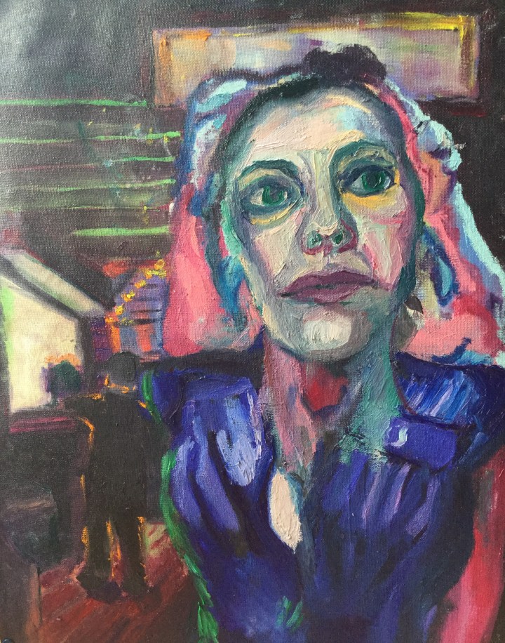
At this stage, I still am waiting for it to dry before I can make any more adjustments.


Exhibitions

The “Young Gods” concert in Zürich Switzerland.

jndennjlhcpobolf

The Landesmuseum, Zürich Switzerland

Landesmuseum_Zürich_(2007-08-29)

A broad spectrum display from Swiss history From Catholicism, Calvinism, The Reformation, to the poverty before WWII and the boost of the banking industry post-WWII.

Poignant achievements in the largest stained glass collection in history, to Lindt artisan chocolates, The Ski industry, watchmaking, and a couple solid contributors to Modern Art.

IMG-1267.JPG
Modern religious stained glass


IMG-1270.JPG
The Steinbock (Capricorn), a symbol of Engadiner pride.  An animal which still inhabits the Swiss Alps


IMG-1271.JPG
One of many colourful lithography pieces advertising a ski resort
IMG-1272.JPG
An embarrassing history of child slave labour pre-WWII
IMG-1264.JPG
… Post- WWII: Look! now we have so much gold we can build banks to house all the wealth we’ve stolen.
IMG-1261.JPG
Mourning Jewelry


IMG-1265.JPG
“Swatch” Original Swiss watch…..invented by a Swiss/Lebanese/American Entrepreneur, Nicholas Hayek

Swatch

IMG-1269.JPG
Fabulous Chocolate Factories

One Swiss Modern Artist

that I first learned about at Landes Museum, inspired me to research a bit more, and write about (see the link below):

meret-oppenheim (1)

After learning a bit about Dadaism and surrealism; I was inspired to “Create something shocking” and “Say something new”… Not very easy as everything seems to have been said or done thus far. none the less… Here is my collage


IMG-1333
Collage inspired by Modern art’s Meret Oppenheim and Dadaism.


The circus in Zürich

keeps it’s animals in a more comfortable home when they are not performing, during the offseason:

http://www.knieskinderzoo.ch/

Elephas_maximus_-_Knie's_Kinderzoo_Rapperswil_2011-11-18_15-22-40Erdmännchen,_Suricata_suricatta_1Knie's_Kinderzoo_-_Giraffa_camelopardalis_Jungtiere_2011-03-25_16-44-00

Musei Vaticani, The Sistine Chapel and St. Peter’s Basilica

Here I learned about “Fresco” and “Chiaroscuro”.  I saw amazing uses of firelight, candlelight and daylight by Artist Raphael, and saw evidence of sarcasm in paintings by the painter/sculptor Michaelangelo, who may have been more of a hostage, than a guest in Vatican city.

Here I learned about “Fresco” and “Chiaroscuro”.  I saw amazing uses of firelight, candlelight and daylight by Artist Raphael, and saw evidence of sarcasm in paintings by the painter/sculptor Michaelangelo, who may have been more of a hostage, than a guest in Vatican city.

sistinestarsplanets
Creation of the Sun and Stars, Michaelangelo


 A Catalogue of photographs of Marilyn Monroe

IMG-1529

Somehow I found this exhibition very melancholy.  A little orphan girl who belonged to no one desperately wanted to be loved by everyone.  Though she nearly was, it wasn’t enough to close the aching hole of rejection and loneliness from her infancy, which tainted her relationships, mental health, and perhaps ended her life.


Exercise in Colour Accuracy

Floral Still Life, Second Time

This time around, I had to rethink my composition and increase contrast.

I tried to keep the tones, hues and chroma as close to the truth as my skills would allow me.

Observational Drawing

IMG-1534 (2)

Quick Color Studies

IMG-1555

IMG-1554

Final Painting

IMG-1551

In Conclusion

I found this painting the most challenging, as I expected better results with contrast and fabric folds.  I still kept the impressionist styles of broken colour (stippling and dry brush technique), yet I tried to record exactly what I saw, as I saw it.


Project Still Life With Flowers

Observational Drawings

This exercise I intend to do twice; the first time in an impressionistic style, and the second time in a realist style.  For the realistic style painting (which I have not yet begun), the observational drawing was most important.  For the Impressionistic style painting (which I have completed), capturing accurate detail was not so vital.

Try as I may, I did not succeed in producing lovely fabric folds. Even with the understanding of varying shadows, temperatures, highlights, and reflected light; my sketches resemble broken bones.

Still life with Flowers Painting, Impressionistic Style

Here I used impasto and broken colour in acrylics.  I would prefer oils, but as this was my first try at knife painting; I thought it may be a waste. I appreciated the way form can be achieved without painting actual lines.  

Complementary Colours

helped me achieve colour harmony and a more balanced appearance in my painting:

       °In areas where my flowers seemed too red, I added green to tone them down. 

       °I dry brushed red over the green leaves, as they seemed detached from the rest

         Of the picture.

      °The vase which was initially blue was too cool but warmed

        with the addition of orange.

      °I added yellow to balance the intensity of purple.

      °I used grey and white to make a more tonally graded painting.

     IMG_1412 (1).JPG

Conclusion

This painting was a lot of “firsts” for me; first time regarding complimentary colours, broken colour, and impasto technique.  I am eager to try this in oils, as I really don’t like the flat-plastic results I had here. I’ve seen fabulous examples of portrait paintings where highly pigmented colours were used in a colour block scheme. I’ve also seen acrylics look stunning in abstract art;  it just has not yet happened for me.  

Exercise, Broken or Tertiary Colours

Tonally Graded Secondary Color Scales

°Orange-red + addition of white, to green blue

This yielded a gorgeous lime green halfway through.

°Green blue + addition of white to orange-red

 resulted in murky grey halfway through.

°Green + addition of white, to orange.

I liked the strong broken colour effect with the second tone, which was the initial addition of orange.


IMG_1459

Exercise; Primary and Secondary Colour Mixing

Yellows, Blues and Reds.

IMG_1457Yellows

From left to right; Naples Yellow, Lemon Yellow, Primary Yellow and Yellow

°Tone –  Naples yellow is the lightest.

° Hue – Both Lemon Yellow and Yellow have a greenish hue.

°Chroma – Primary Yellow is the most intense yellow pigment.

Blues

Turquoise Blue, Cerulean Blue, Ultramarine Blue and Pthaleo Blue.

°Tone – Turquoise Blue is the lightest.

°Hue – Turquoise has green/yellow hues.  

          – Ultramarine Blue has a violet/red hue.

°Chroma –  Pthaleo Blue had the most intense blue pigment.

Reds

Vermillion, Naphthol Red, Quinacridone Red, Carmine, and Cadmium Red.

°Tone – Vermillion is the lightest, while Carmine is the darkest.

° Hue – Both Vermillion And Naphthol Red have yellow/orange hues.

°Chroma – Cadmium Red has the most intense of red pigment

Primary scales yielding secondary coloursIMG_1458
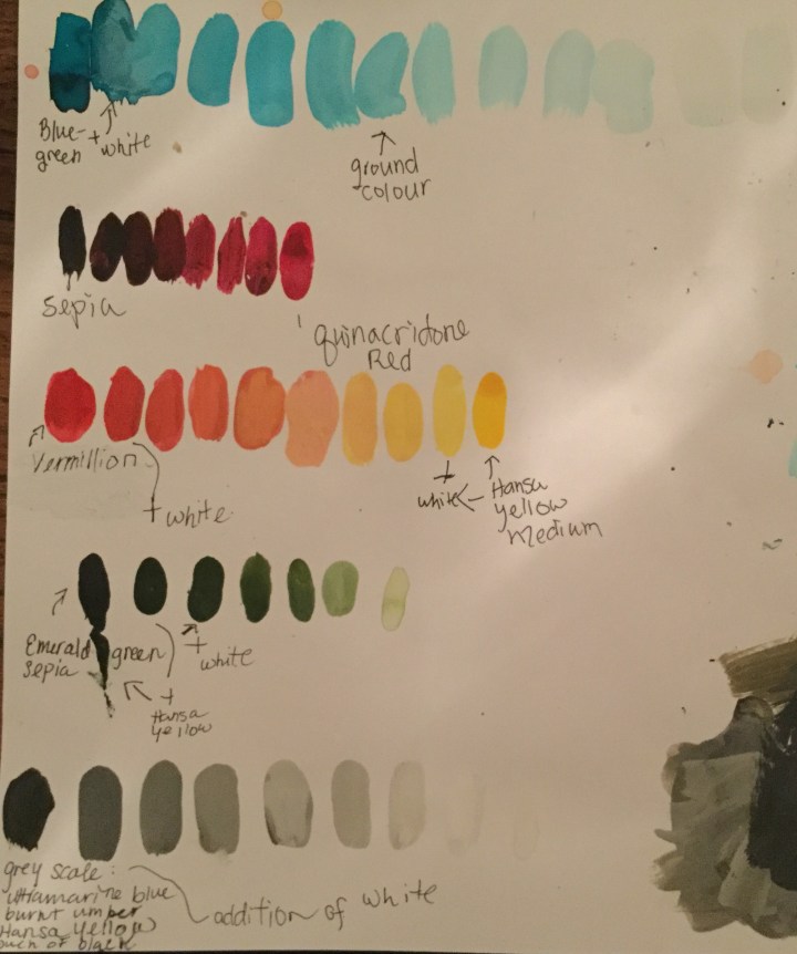
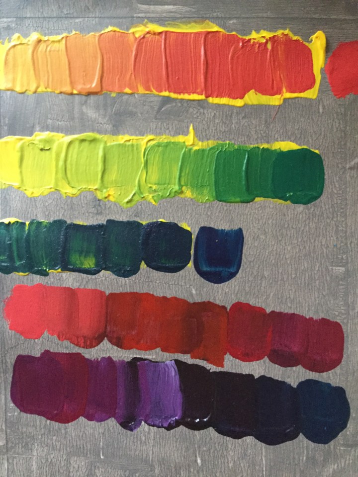
Yellow to red – secondary shades of orange.

Yellow to blue – secondary shades of green.
Red to blue – secondary shades of magenta.
                    – with the addition of white secondary shades of purple and violet.

Primary colours of equal tonal value yielding secondary colours


IMG_1461

Red to blue became a muddied grey halfway through the scale.