Exercise telling a story, Pg. 96

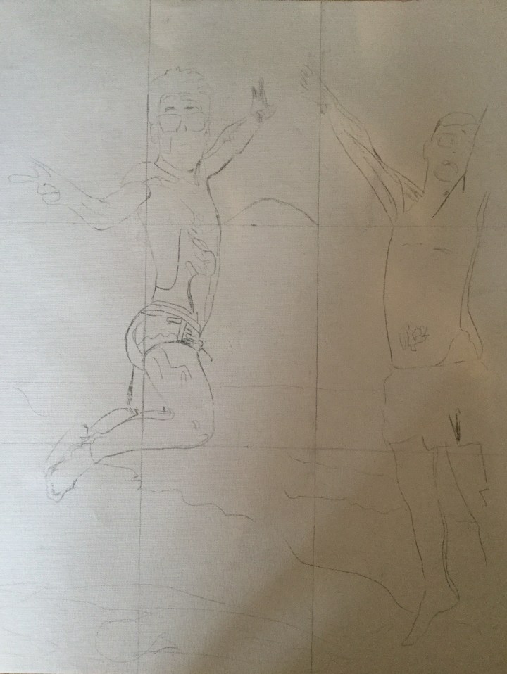
For this exercise, I used all of my resources of colour, tone, shape and line to convey a narrative. I continued in the vibrant palette of the fauvists and only slightly outlined the main characters this time. I felt it may have been overdone in the conveying character exercise. As I know my tendency to add too many distracting details in the background, I began with a simple sketch. The narrative was only going to be “A Day at the Beach”.

AE8A8E34-8BB3-4F12-B515-A944E6FEFF0C

After I painted the main figures and seascape, I found it much too cliche’ and thought it would be improved by some hints of danger. I then painted over most of them, save a few. I decided that I wanted this to be more of a modern-day apocalyptic narrative, with two angels at the beach. I tried to keep the dangerous aspects to a few: A landmine warning sign in the corner, giant jellyfish, Japanese whaling boat, and an impression of Michelangelo’s God flying away showing his bum to all.

AA4C9CD8-6CE5-4EB2-BB3C-1A05419C1C36

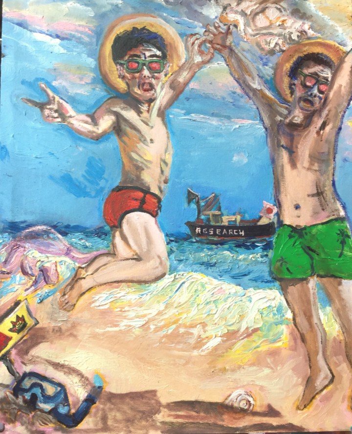
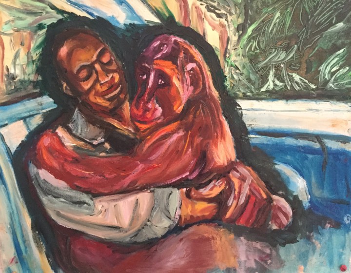
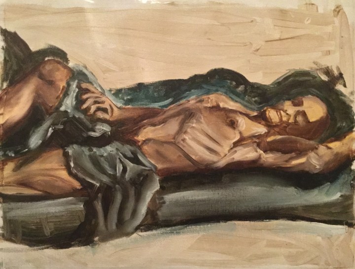
This time I felt the hands improved.

Exercise A figure in an interior

For this exercise, I wanted to achieve a lonely mood, with a subject in dark surroundings. This time my model was clothed and more comfortable, in his evening element. Because I wanted to experiment with broken brush strokes, rhythms, and impasto paint, I began this exercise earlier on. I’m glad I did so as the initial interior was too detailed and distracting from the subject. If I were to try this again, I would like to experiment with the Interior being more detailed and the figure being blurred (as in Alexander Kanevsky’s work).

I tried to stick to the fauvist palette to keep things vibrant.

Because he had fallen asleep, I didn’t feel like he would mind sitting one position for so long. I did eventually cover him with the blanket as it was rather chilly with the windows open.

34BFEE38-1D76-4B25-B247-34F6CA732796

More than a few times, I had to scrape off paint and try again; especially in regards to the interior. This went on over a period of several days. The hands were the most challenging and somehow disproportionate to the rest of him. They resemble Muppet hands. I found it difficult to layer paint thickly and achieve detail, but it was fun.  I also used much more paint than I anticipated with all of my oil paintings for this section. I’m aware that I can make some adjustments to improve this painting, but for now, I need to move on to the next assignment or I will never finish.


Exercise conveying character, Page 91

I was inspired by Marlene Dumas’s portrait of ‘The Widow’, and how she recorded a meaningful moment. I like the vibrant colour palette used by fauvist expressionists and decided to use it for this study and the remaining exercises of this coursework. I chose a photo which I’d like to give credit to which I feel captures a momentary expression, impossible to achieve in an all day sitting. Again I wanted to work more with background mark-making as well as experiment with colour. I aimed for a likeness, but not a realist version of the subjects in the photo.

F5CDE392-647E-4604-947D-42FA87C11141
The People’s Choice award in the Natural History Museum’s Wildlife Photographer of the Year competition went to this photo of a lowland gorilla and the man who saved her (Picture: Wildlife Photographer of the Year: Jo-Anne McArthur)

I did a light sketch in pencil and conte:

CD44C78B-7A3B-4574-8BA8-074E201A5509

Then painted wet into wet using the fauvist palette:

968B6833-15EB-48F8-84C6-005FC8230B16

When near the end, I outlined the figures in a dark value to distinguish them from the background.

7A742335-A479-424B-8808-1705D8736C94

I found it a bit hard to interpret the expression on the man’s face as looks down at the gorilla. Technical issues I encountered with the handling of my paint were the strong fumes from the linseed oil. I had until everyone was in bed so that I could begin working with open windows. may open the windows. After reviewing all the portraits thus far, I found this one required the most time, yet was more successful in conveying what I wanted it too. Perhaps before I was more focused on conveying a mood or getting proportions right.

Exercise Creating mood and atmosphere, Pg. 90

For this study, I set out to achieve an energetic mood, and experiment with colour. I wasn’t attempting unusual likeness. I also wanted to practice more creating background with nondistracting marks and blurred lines.

Preliminary sketches using myself as the modelIMG-1925

I prefered the second one to the first. I followed the same technique as in my self-portrait; a charcoal sketch with values, fixing, washing in Quinidine red acrylic ink. Unfortunately, I did al of this on the rough side of the canvas which had too much tooth. So I had to add a couple layers of clear gesso and allow drying time. I then rewashed. EF81C569-9D38-423E-A3F1-47E437D53C1B

I pinted in the background plus negative shapes first. I outlined the figure in a dark value. Here I made the mistake of not allowing it to dry. I moved onto painting the darkest values and starting to add highlights.  Because my initial lines had become obscured, I lost all the proportions of the figure. I then had to try to re-establish them later, but they were still gross abstractions. Because there was so much medium, the paint was not drying quick enough. I am just learning the handling of oil, now appreciate the “fat over lean” concept. I used an initial colour palette of permanent rose, Ultramarine blue, Pthaleo blue, Pthaleo green, Cadmium yellow, flake white and zink white.10F7D0BD-C360-4E65-BAD1-6EB90793644F

At this stage, I still am waiting for it to dry before I can make any more adjustments.


Exercise Self-Portrait, Pg. 87

This study I did after the head and shoulder of my model; as I needed to work around his schedule. I found this one particularly hard, perhaps because we all had the flu, and I couldn’t bear looking at myself. I felt a bit used and run around by my family as well. It was challenging adjusting mirrors and light. I used the reverse camera on my computer for the forward glance and a side mirror from the profile glance. Initially, I had natural light but later changed to one artificial light source.

D1BD0D3B-2B58-47E9-B1F6-96A0547BAFFA

I did the initial outline in pencil, then added in values with charcoal. I sprayed fixative on the canvas. Once dried, I washed the sketch with quinidine red, Acrylic Ink. This alone gave me some great darker values and mid tones. I used a palette of yellow ochre, raw umber, burnt umber, cerulean blue, Cadmium green, flake white and titanium white and cadmium red. I tried to paint as little as possible. I felt the nose, chin and ear hardest to tackle; probably my attempts to repaint them made them grow awkwardly large. Then I had to readjust the size of the eyes to match.415111EE-BF64-4F18-9904-C2567A3940A6

Does it have a likeness to me? More a likeness of how I was feeling. My husband says it has something, says she’s always watching him and he feels judged.

Exercise Tonal study figure, Pg. 84

This time I didn’t have the luxury of natural light and had to use artificial light sources. I wonder how it must have been for Rembrandt and Vermeer working by candlelight and how they were able to achieve such great tonal values without going blind.

In preparation for this painting, I repositioned my desk lamp several times to achieve the most dramatic effects. I first created a linear figure study with the same palette as the previous exercise.

7ADEBA8B-8255-4306-A48C-12E7E0145499

I created a grayscale and matched the values to those of my linear study. I added some gestural marks to help define his features. Unfortunately, I lost contrast when I applied the greys.

DBA57647-79F7-4D0B-A990-D45FE75AF560

This where I feel a bit stuck. I began glazing, hoping to bring more contrast, and am now not sure how to continue. I’m sure it could be much better, but do not know how exactly how to improve it without damaging it further. I believe it has something to do with the balance of warm and cool.5D622B35-673C-461D-AB69-0D2EDFA56A75

Exercise Linear figure study, Pg. 83

For this drawing in paint exercise, I used diluted raw umber to draw shapes of the figure. I added a touch of cobalt blue to the mixture and outlined the negative shapes. Once dried I applied a thin wash of sepia over the figure, and a thin wash of umber and cobalt blue with a touch of yellow, to the negative shapes.

Adding a bit of medium to slow the drying time, I blocked in the darkest shadows with umber. For the highlights on the subject, I used some of the initial wash of sepia with flake white. Because the paint was still wet, I was able to easily blend the shadows and highlights, creating more mid tones. For the outlining negative structures and shapes, I used a mix of the umber/ cobalt blue/ yellow wash with medium and flake white. I then blended them the darkest and lightest areas.

I did have issues with paint dripping as I worked on this. Eventually, I laid the canvas on a flat surface. I was fortunate enough to have good natural lighting that day. My model was quite uncomfortable on the hard floor. Because of his understandable shyness at being nude, I draped a blanket partially over him. I appreciate how patient he was with me. I found I already had great tonal values here without applying a grey scale.

E284D402-F3AD-4A2E-9D87-2789A9423F9C


Exercise head and shoulder portrait, Pg.88

Before beginning this exercise, I  studied some different lighting effects, using a single light source.

IMG_1936465E4ACD-5F20-432E-8289-CB6CF51601F5

I had my sitter return to previous position (sketched in the first exercise). I created a small study of washes and outlined his shape in diluted paint.88374bdd-6b6e-4369-b267-2ce3696623c0.jpeg

I then began working on larger canvas using a diluted mix of raw umber and OMS. I blocked in the background loosely. I blocked in the darker areas with an even darker raw umber. I dry brushed in the shadow lines. I diluted the umber a bit and filled in the shadows. I used flake white to block in the lightest areas. I marked the position of my sitter and took a break. In the following session, I prepared a greyscale of eight values. I found in the end that it was far too many, and my eyes were strained trying to discern between them. I referenced my previous greyscale done in acrylic, in the first section of our textbook, to create equal values in this oil mixture. This time I added a bit of cadmium red to the blue/ yellow base, to increase the warmth, and created successive values with additions of flake white. I couldn’t achieve enough distinction using flake white, so I switched to titanium white. Four values alone would have been enough. I started with the lightest areas first, then worked my way through the mid-tones to the darkest values. I went back and re-established darkest darks and lightest lights. I then added some gestural marks. During this process, I lost the form and proportions of my work a bit. I also lost my model and to utilize photos to reference shadows and light.

19FBECD6-7EDC-45BB-93D3-4E4F667F2B91

I like the contrast between the warm background and cool subject. Like every painting, it still feels incomplete, but I have to move on to other exercises.


Exercise Quick Sketches Around the House

One Point Perspective

IMG-1516IMG-1517IMG-1518

Two point perspective drawing in paint

IMG-1562

Conclusion

This was by far the most difficult exercise for me. Simple as it may be for others; I am a total beginner at drawing.  The two-point perspective rough sketch took me a full day.  The drawing in paint took even longer!  The paint handling itself felt a bit clumsy, but luckily gouache is forgiving.

Exercise Still life With Colour Used to Evoke Mood

For this exercise, I used direct painting.

I tried to yield an intimate environment.

IMG_1420

The results were more sinister than I’d hope.  I chose this exercise to improve upon for my “Assignment Two” project.  I started from the beginning, spending time researching how other artist’s had achieved warmth in paintings,  as well as fabric creases and folds.

Assignment 1

Observational Drawing and colour study

IMG_1503

Final Painting using indirect painting

IMG_1508

Notes:

This time I was able to yield a warmer, more intimate result.  I used a fuller range of values and hues of both warm and cool tones, achieving greater tonal contrasts.   I think the painting would have more luminosity had I used oil glazes instead of acrylics.  Achieving fabric folds was the biggest challenge, and I will continue practising techniques by other artists.