Exercise, Complementary Colours

Color Wheel

IMG_1462

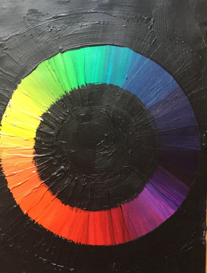
Twelve Colors of Chevreul’s Color Wheel and Circled Pairs of Opposites

IMG_1455

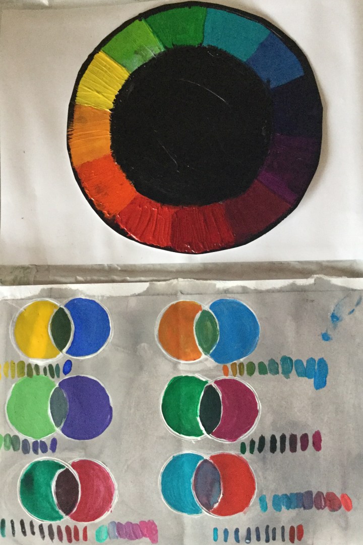
Notes on Complementary colour mixing

Complementary colours placed next to one another seemed to provide the most aesthetically pleasing contrast; with each colour enhancing its opposite. Unfortunately, when complementary colours were combined they yielded ugly greyish results.  Even with the addition of white, I was not able to produce any lovely colours, though it was an improvement.

Exercise, Broken or Tertiary Colours

Tonally Graded Secondary Color Scales

°Orange-red + addition of white, to green blue

This yielded a gorgeous lime green halfway through.

°Green blue + addition of white to orange-red

 resulted in murky grey halfway through.

°Green + addition of white, to orange.

I liked the strong broken colour effect with the second tone, which was the initial addition of orange.


IMG_1459